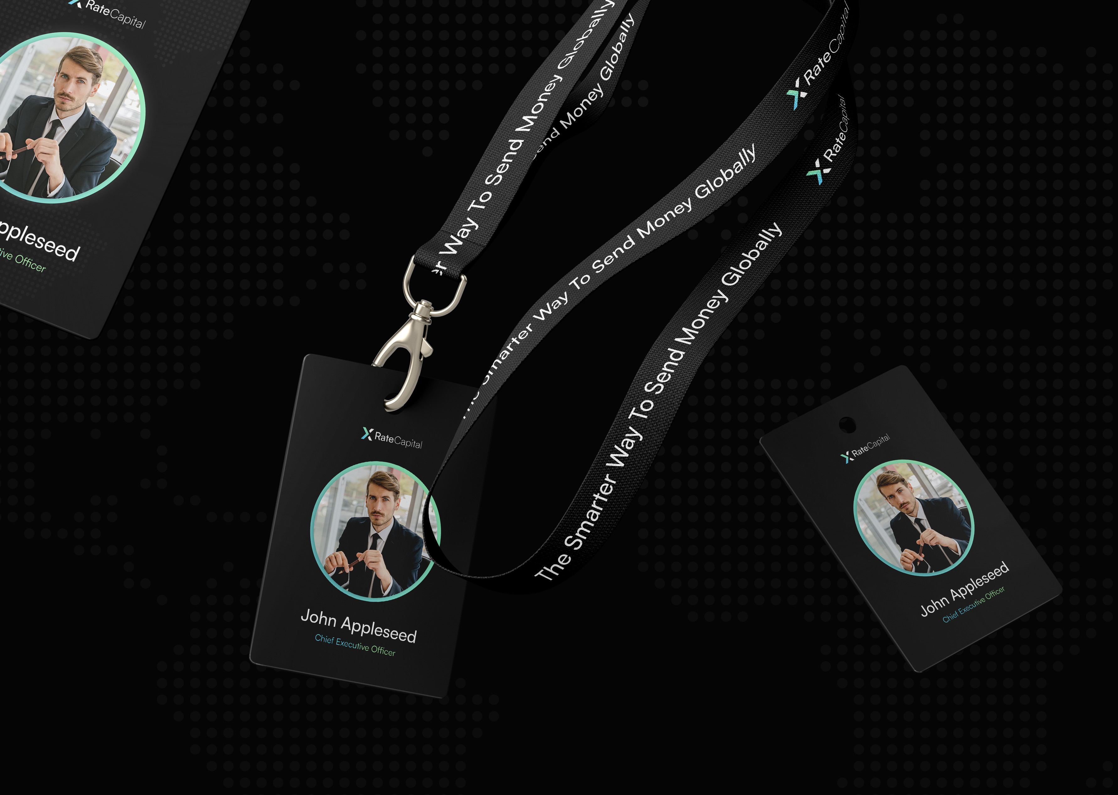
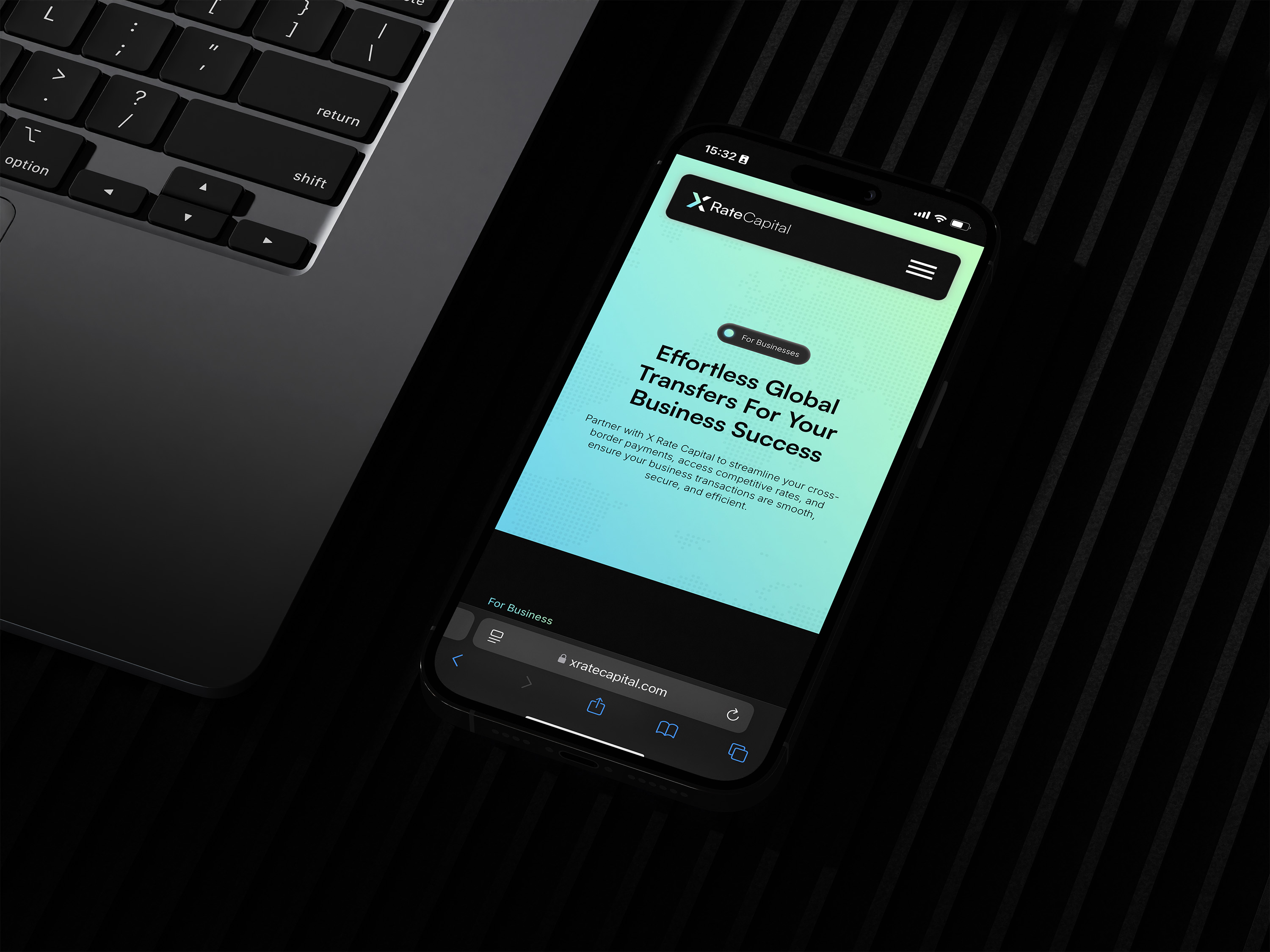
X Rate Capital approached us wanting to disrupt the currency exchange market with lower rates and fairer structures. They needed a brand identity and digital presence positioning them as "The Smarter Way To Move Money, Globally" whilst appealing to younger international investors and businesses. Our three-month Keystone engagement encompassed comprehensive brand strategy, identity creation, and website development all designed to position X Rate Capital as a forward-thinking alternative to traditional exchange services.
Strategic workshops with X Rate Capital's founder revealed their operational advantages and long-term vision. Market research uncovered a critical insight: whilst younger demographics increasingly engage with international money transfers, most competitors maintain unapproachable, overly corporate aesthetics.
We positioned X Rate Capital as the progressive alternative, combining technological innovation with genuine transparency. The visual identity balanced financial credibility with contemporary design—mint green and light blue gradients evoke stability and innovation whilst creating movement reflecting cross-border transactions. The logomark features a crafted "X" symbol with detached sections, creating the impression of crossing over—a subtle visual metaphor for seamless international transfers that works effectively across all digital and physical applications.
Our website strategy created intuitive pathways guiding visitors from information to platform access. We developed streamlined navigation with seamless FX platform and CRM integrations for efficient onboarding, built on scalable architecture designed to accommodate rapid growth. The launch exceeded expectations with over 100 customers onboarded organically in the first month, validating our approach of creating a brand that speaks to evolving international finance users whilst maintaining essential credibility.


The financial services landscape is crowded with brands that look remarkably similar—conservative colour palettes, rigid typography, and conventional imagery. Our research revealed that as the demographic engaging with international money exchange services shifts younger, these traditional visual codes were becoming less effective.
For X Rate Capital, we crafted a visual identity that signals trust and professionalism while embracing contemporary design principles. We developed a distinctive colour system featuring a gradient of mint green and light blue—colours that evoke both financial stability and technological innovation. This gradient approach creates a sense of movement and transition, subtly reflecting the cross-border nature of the business. The resulting identity stands out distinctly in the competitive landscape without sacrificing the credibility essential in financial services.


The centrepiece of X Rate Capital's identity is a thoughtfully crafted logomark that communicates the brand's core function through subtle symbolism. The "X" symbol features detached right sections, creating the impression of the left side crossing over—a visual metaphor for crossing financial borders seamlessly.
This distinctive mark works effectively across digital and physical touchpoints, maintaining its impact whether displayed on the website, mobile screens, or physical materials for trade shows and events. The mark's simplicity ensures it remains recognisable even at small sizes, while its distinctive form creates an ownable visual asset in a category often defined by generic symbolism.


Our typography selection played a crucial role in establishing X Rate Capital's brand personality. We selected Satoshi, a geometric sans-serif typeface with clean lines and balanced proportions. This typographic choice embodies the perfect balance between professionalism and contemporary feel that modern fintech demands.
Satoshi's versatile character set offers excellent legibility across digital interfaces while maintaining a distinctive character in headline applications. Its geometric construction communicates precision and reliability—essential qualities for a financial services brand—while its modern proportions and subtle details avoid the coldness often associated with traditional banking typography.
Senso brought our brand to life and made it feel effortless. From the first engagement, they understood our goals and delivered exactly what we wanted. Their expertise in branding is outstanding, seamless, transparent, and a pleasure to work with. We're excited to continue our partnership!


