X Rate Capital
We built X Rate Capital from zero. Brand, identity, and website for a currency firm founded on the one thing the industry hides. Clarity.

Introduction
X Rate Capital is a regulated FX firm moving money across borders for businesses and private clients, built on a promise the category rarely makes. Transparent pricing, with no spread buried in the rate. Built on over seven years in the industry, the firm came to us to create the brand and website from scratch.
A category built on not telling you
The spread is real, significant, and almost nobody sees it.
The founders arrived with seven years in currency exchange between them, and a company with nothing to put in front of anyone. No brand, no website, no name anyone outside their own network would know.
Currency exchange runs on a quiet asymmetry. The gap between the rate a firm quotes and the rate it bought at is the margin, and most clients never see it. The obvious brief was to look like the others, only better. A sharper navy, a tidier site, a firm you would trust because it resembles the firms people already trust.

The logomark, the first thing the firm had
The opening was never a sharper rate. Rates move, and anyone can undercut you for a week.
So we asked them to publish the numbers their competitors hide.
Leading with the live mid-market rate is not a flourish. It is the benchmark every firm prices against, so any visitor can work out roughly what they are being charged.
They agreed without much argument, which told us the positioning was real rather than aspirational. Everything after that decision was execution.
Credible without the coldness
Regulated money demands trust. It does not demand distance.
High-value transfers need a brand that feels safe enough to move six figures through. The category decided that safety looks like a bank from 2009. We disagreed.
The logomark

The mark is an X with its sections detached, the left crossing the right. Money moving across a border, held in one form. Detached, it reads as movement rather than a monogram.
Built on a geometric grid, so every angle is a decision that can be repeated rather than eyeballed. That matters when other people will apply the brand later.
Mint and blue replace finance navy. Mint does the heavy lifting, because nobody in the category will touch it and it reads as open rather than institutional.
A brand is only as good as its least considered surface
Where a system usually falls apart.
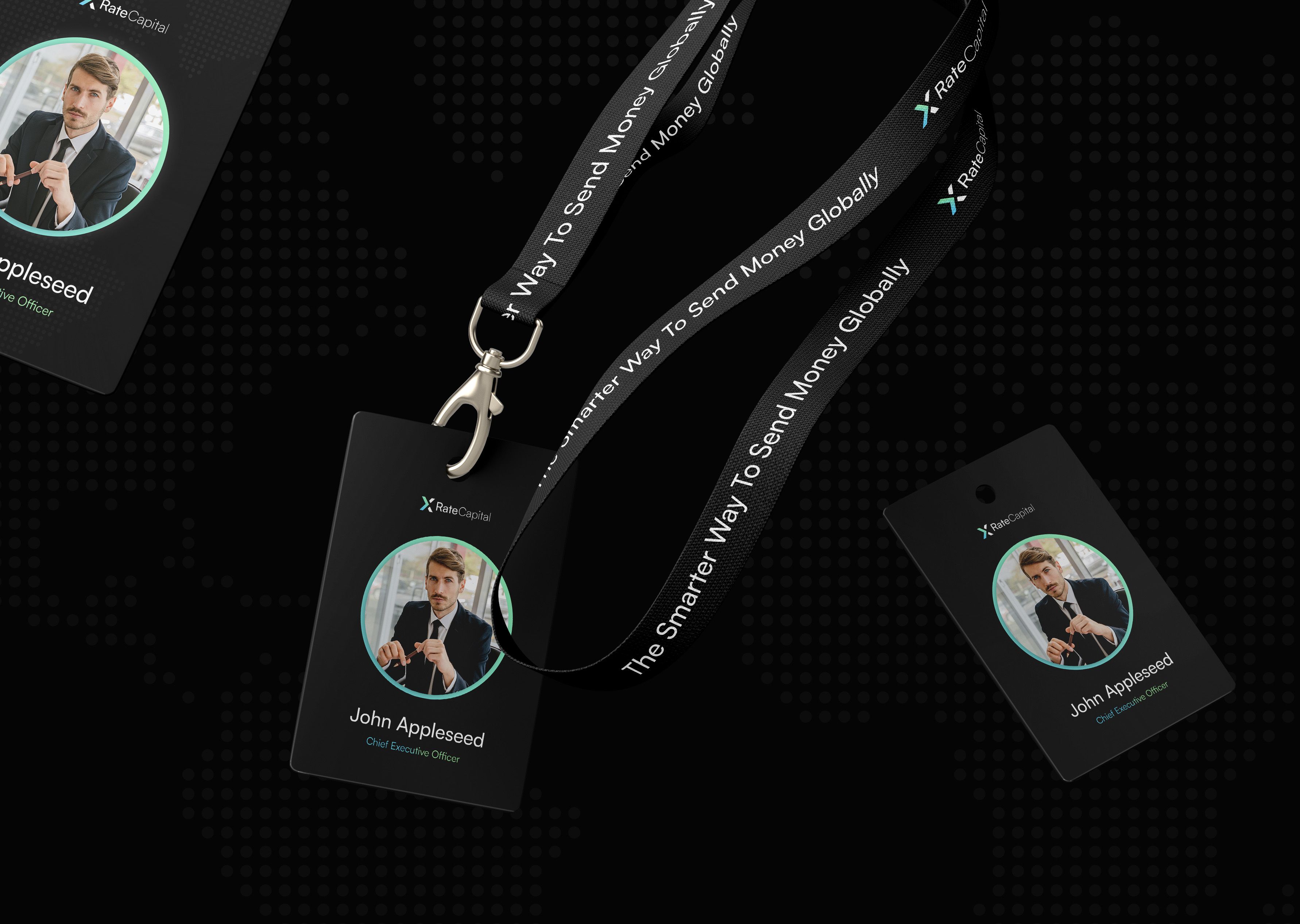
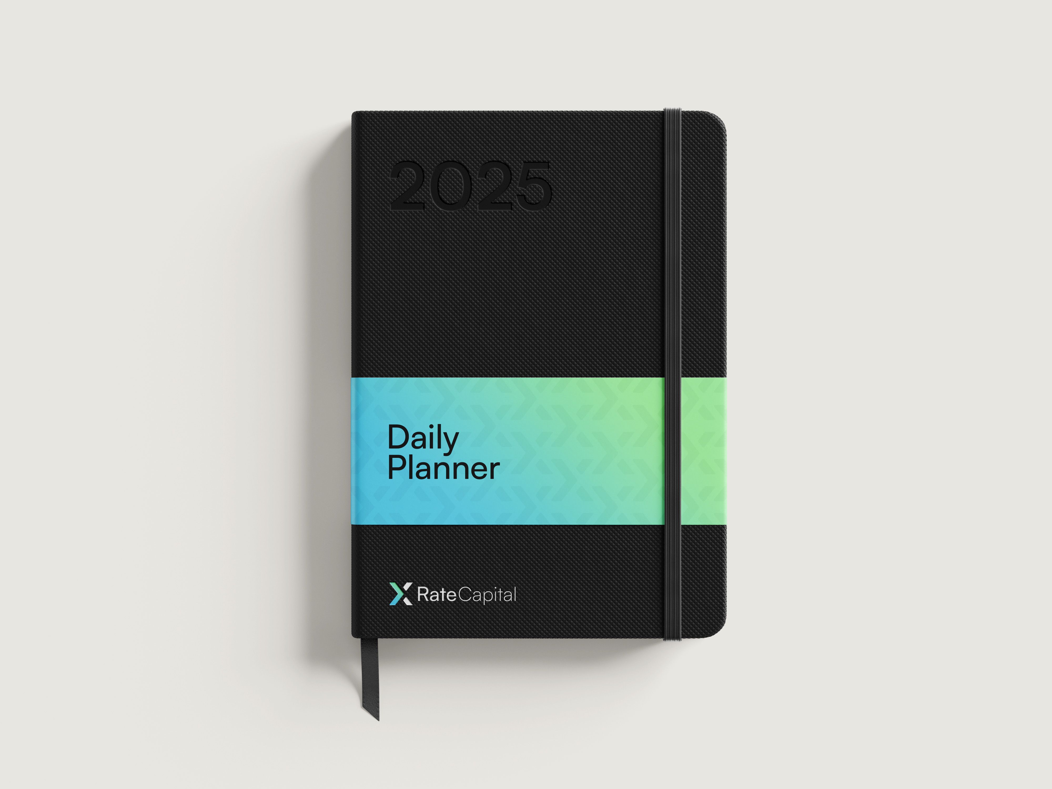
A logo survives a presentation. A system has to survive everything else. The polo shirt at an event, the card handed over after a meeting, the document a client signs.
Saying the number out loud
In a category fluent in hedging, plain speech is a position.
Financial services has a house style, and it is evasion. Bespoke solutions, competitive rates, tailored to your requirements. Language built so that nothing can later be held against you.
A firm that leads with the mid-market rate cannot then write like one that hides it. The copy would undo the proposition on contact, so the voice says the number out loud.

In application
Six words carry the entire positioning. Prices like a desk, serves like a concierge. Institutional pricing, personal service, in a line a client can repeat to a colleague.
Showing the number everyone else hides
The website is where the claim gets tested.
If clarity is the product, the brand has to show its working, not promise it.
The homepage opens on live mid-market rates, the decision made visible. A visitor sees the benchmark before speaking to anyone, a small act of confidence a competitor cannot copy quickly.
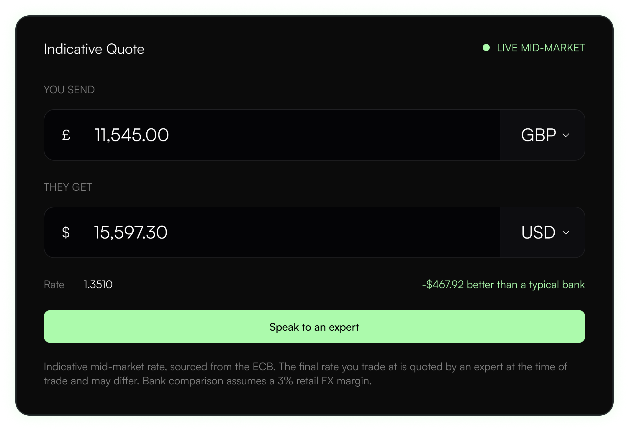
We prototyped the rate display before anything else. A live number carries a burden a static one does not. It has to stay legible while it moves and never look stale.
The rest of the interface follows the same rule. Nothing is shown that cannot be checked, and nothing is asked before it is needed.
The gap where firms lose people
Between curiosity and a conversation.
Most of the category loses people between interest and contact. A long form, questions nobody wants to answer before they trust you, and a wait. X Rate asks for less, sooner.
What comes in writes straight to the CRM, so the person who calls back already knows who they are speaking to rather than starting again.
Live, and built for where they're headed
X Rate Capital launched with a brand and a website that behave like the promise underneath them. Open, legible, easy to act on. The build became the start of an ongoing partnership.
“The team brought our brand to life and made the journey feel effortless. From the first engagement, they understood our goals and delivered exactly what we wanted. Their expertise in branding and web development is outstanding—seamless, transparent, and a pleasure to work with. We're excited to continue our partnership!”
Got a project in mind?

