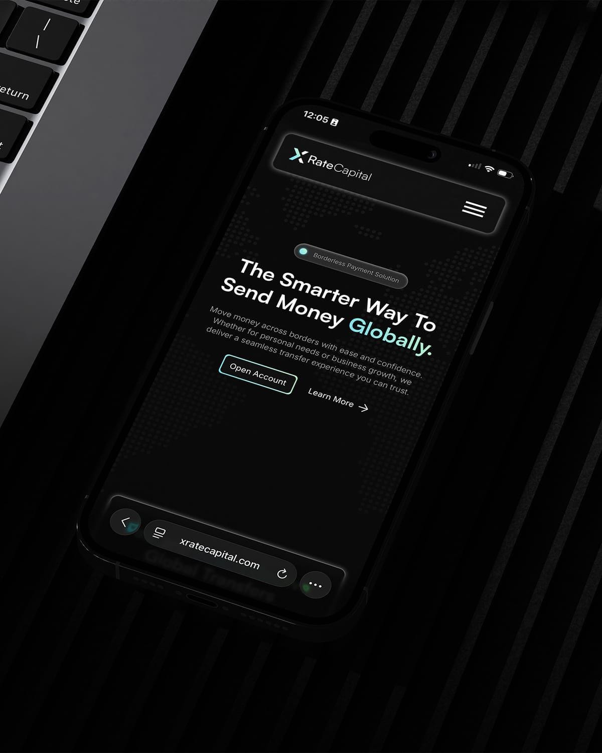
Design systems that scale with your product.
Senso builds design systems that give product teams a single source of truth, from token architecture to component libraries and living documentation.


Design debt compounds fast. We build the system once, correctly. Your team ships faster from day one.
When every page is built twice
Without a design system, the same button gets redesigned in five files, three shades of your brand blue ship to production, and every new screen costs more than the last. A design system fixes that at the root. We build component libraries and design tokens that make consistency the default instead of a constant battle. Colour, type, spacing, and components live in one source of truth, defined once and reused everywhere. Designers stop reinventing, engineers stop guessing, and your product stops drifting apart visually. The payoff is speed: new features assemble from trusted parts. A real design system is infrastructure, not a style guide gathering dust.
Tokens are where it actually scales
The magic of a modern design system is in the tokens. Define your colours, spacing, radii, and type as named variables, and a single change ripples through every product that consumes them. Rebrand, add a dark theme, or adjust your spacing scale without hand-editing a thousand screens. We structure tokens so design and code share the same names, which means a value in Figma maps cleanly to a value in the codebase. No translation, no drift. We connect the design side to the build side so the library is not two separate things pretending to agree. That is what lets a system stretch across web, app, and brand without fracturing.
A system nobody uses is wasted money
Plenty of design systems get built and then ignored, because they are hard to adopt or nobody documented how. We design for adoption from day one. Components come with clear usage guidance, sensible defaults, and the variants teams actually reach for, not an academic catalogue of edge cases. We document the why, not just the what, so people trust the system instead of working around it. We help your designers and engineers integrate it into their real workflow and tooling. A component library only pays off when it becomes the path of least resistance. Our job is to make using the system easier than ignoring it.
Selected Work
Our Work
What we do
Before anything is designed, it's decided. Positioning, research and brand architecture that give every decision after it a direction.
When the experience is the product. UX and UI for websites, platforms and apps, researched, prototyped and tested for the people who'll use them.
From first wireframe to shipped product. Websites, apps and design systems built to be maintained, measured and grown.
The operational layer behind the brand. CRM, automation and integrations that keep growing teams fast and organised.
Brand
- Brand Identity
- Brand Strategy
- Brand Guidelines
- Market Research
- Commercial Modelling
Design
- UX/UI Design
- Web Design
- App Design
- Design Systems
- Prototyping
Product
- Website Development
- App Development
- E-commerce Development
- CMS Development
- Product Management
Systems
- Internal Tooling
- CRM Implementation
- Workflow Automation
- System Integration
- Data & Reporting
Our Model
- 40+ COMPANIES PARTNERED
- 2 REGIONS, MCR · DXB
- EST. 2022
Frequently asked questions
If you have one product and a small team, probably not yet. Design systems earn their cost once you have multiple products, several designers or engineers, or a product growing faster than you can keep consistent. If you are shipping the same components repeatedly, fighting visual drift, or dreading a rebrand, a system pays for itself quickly. We will tell you honestly if you are not there yet.
Typically design tokens (colour, type, spacing, radii), a component library in Figma, the matching coded components, and documentation covering usage and guidelines. Depending on scope we may include theming, accessibility standards, and contribution guidelines so your team can extend it. We scope to what your team will actually use rather than building an exhaustive library you will never touch. The aim is a working system, not a museum.
Yes, and this is where most studios stop short. We build the design library in Figma and the production-ready coded components to match, usually in React with tokens wired through so the two stay in sync. A design system that lives only in Figma drifts from the code within months. Building both sides together is the only way it holds up over time.
Adoption is a design problem, so we treat it as one. We document clearly, set sensible defaults, ship the variants teams genuinely need, and integrate the system into existing workflows rather than bolting on a process. We involve your designers and engineers while building so it feels like theirs. A system only works when using it is easier than going around it, and that is what we optimise for.